Wednesday 28 April 2010

Spring window displays development

This is the development process of my spring vinyl window displays.


Tuesday 27 April 2010

Spring Poster Development

Here is the development of the Spring promotional posters using the designs that I have used in the window display to create and form a pattern.


Vinyl transparent window displays

I printed my designs on acetate to see what they would look like if they were vinyl stickers on windows. I photographed them to see if they were clear enough to be seen. Some of them work well which is mostly the more colourful designs unlike the white daisy spring one all you can see is the inside of the flower because the type gets lost in the window background. I need to reconsider the colours that I used and the image size.


Typography

Here I have formed patterns with the use of typography and the handmade type that I have created out of flowers. I have used images that relate to spring to create clipping masks to form a fresh and bright background for the spring type.

Monday 26 April 2010

Spring Window Display Development

Using the flower typeface I have put it into the computer to apply it to other imagery. I think it works better on its own because if I put it behind a background which I have done the quality of spring seem to get lost and becomes un clear to read.

Autumn

Looking back and reviewing my Autumn window vinyl designs, I wanted to go back an review my tree designs looking at the colours and weight of line that I have considered. I have adjusted my design so the design is all block colour rather then both line drawings and block colour, this was also mentioned in the last crit that I should do one or the other line or block. I have also tried our a few other ideas using typography by using the squirrels from the tree and creating leaves from these and then forming this into a typeface, I don't like this it doesn't work as well as the other design it looks flat and un interesting to look at.


Tuesday 6 April 2010

Spring Window Display Development

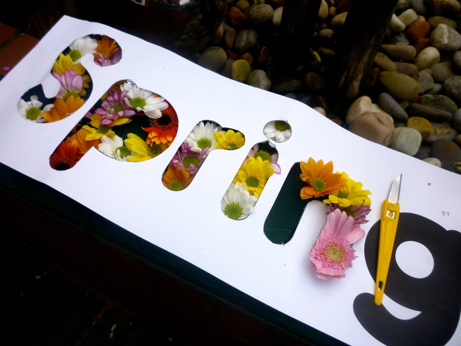
With the ideas that I had of creating typography to display Spring in some way. I thought about creating the words Spring and Blossomed out of flowers on a large scale.
With the typefaces that I chose that I thought that were relevant to to Spring I used them as a stencil on the plant oasis to push the flowers on to, to get the right form of the letters. I chose a selection of bright flowers that I gave the message of fresh, bright, and clean.

I feel that this have worked really well and shows the message clearly of Spring and gives a bright vibrant attraction. Looking at it from a viewers and shoppers point of view this is definetly something that would catch my eye and something that I would want to look at.
One thing I am worried about is if the word Spring is legiable enough. I think I will be able to see if it is when I start applying it to things.

Here are a few photos of the development process...